
Introduction
Robinhood changed mobile investing by creating a bold and easy-to-use app that makes people feel confident. The Robinhood UI balances the serious side of managing money with a design that feels simple and natural, helping users handle complex tasks in a smooth and thoughtful way.
1. Easy Start: Building Trust Right Away
From the first screen, Robinhood shows that simple design helps people feel confident. Instead of confusing new users with long forms or complicated financial words, the Robinhood UI uses big, easy-to-tap cards to guide them step by step through the sign-up process. Each stage—from personal information entry to bank linking—appears one at a time, reducing cognitive load and creating a rhythm that feels purposeful. The animations are subtle yet meaningful; loading indicators use motion to convey progress without pressure. Visual hierarchy is carefully considered, with bold headers and soft text cues that make next steps obvious, but not aggressive. Even regulatory disclosures are presented in collapsible formats, allowing users to engage only when needed—this shows a unique balance between compliance and user respect. Ultimately, the onboarding flow gives the user a sense of control, framing the app not as a gatekeeper, but as a partner in their financial journey.
2. Color‑Driven Decisions: Emotional Resonance
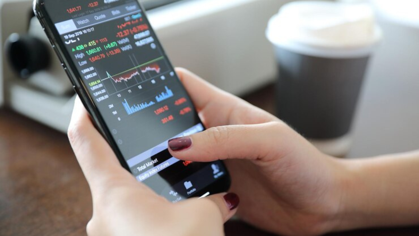
Color in the Robinhood UI goes far beyond decoration—it silently directs behavior, sets mood, and reflects financial context. The interface uses specific tones to communicate real-time data and status without overwhelming the user. This is especially valuable in high-stakes environments like stock trading, where quick interpretation can drive faster decision-making. Instead of using lots of popups or alerts, Robinhood uses color to quickly show what’s going on. Just a quick look lets users see which stocks are going up, which are going down, and which are staying the same.
Here’s how color operates as a functional design language:
| Color Usage | Context | Emotional Cue | User Benefit |
| Green Highlight | Positive stock movement, portfolio gains | Confidence, optimism | Encourages further engagement |
| Red Highlight | Negative stock movement, losses | Urgency, caution | Triggers reevaluation of decisions |
| Grey Background | After-hours or unavailable data | Neutrality, calm | Reduces pressure to act |
| Light Green Accent | Healthy account balance overview | Reassurance | Reinforces a sense of stability |
| Blue Links/Icons | Interactive elements and pending actions | Trust, clarity | Enhances intuitive navigation |
The application of color in this manner lends the interface the sense of emotional intelligence. The Robinhood UI does more than just inform; it communicates in a manner that mirrors the feelings one has when dealing with money: a sense of hope, vigilance, and liveliness.
3. Card‑Based Layout: Empowerment Through Focus
At the heart of Robinhood’s interface, is its modularity in the card’s layout. All data is organized into purposeful, interactive ‘blocks’. Cards are used to display each listing representing a stock, ETF or crypto; you simply tap the card to expose charting, news, and buy opportunities in the respective area of interest. Robinhood’s UI makes it easy for the user to expand out the data they are most interested in; users don’t have to deal with a series of messy dashboards, as they simply expand out into the areas that they care about. This arrangement fits a person’s natural approach to thinking–one choice at a time–not trying to do everything at once. When users are swiping through the app, it isn’t active decision-making it feels fluid and easy, and it takes advantage of mobile’s upside. Still, the card layout feature gives users just enough distance from other cards, so the user doesn’t forget that there is lots of info. Users can quickly add stocks to their watchlist, make trades, compare option trades etc., without getting losing themselves in any particular part of the app. The app is always accessible, organized and flexible, making it appealing to both new investors and more experienced investors that find themselves navigating to take action quickly.
4. Smart Search & Easy Watchlist Features
Robinhood’s search tool is quick and easy to use. As you type, it shows suggestions right away, helping you find the stock or crypto you’re looking for without needing to type the full name. Once you see what you want, you can tap it and instantly add it to your Watchlist—a place where you keep an eye on your favorite assets. The app also gives you a short message to confirm the action, so you know it worked.
This makes the Robinhood UI easy and fast to use. You don’t have to search through menus or click around a lot. Most things are just one tap away, so it’s simple to stay focused and manage your investments with ease.
Final Thoughts
Robinhood’s iOS app is more than just a tool for investing—it quietly supports users in a way that feels thoughtful and personal. From signing up to checking your portfolio, the design speaks to both logic and emotion.
With the Robinhood UI, users aren’t just placing trades—they’re using an app that understands their feelings and keeps things clear and focused. It doesn’t try to impress with complexity; it builds trust through smart, human-centered design. That’s what makes it stand out—it’s not just nice to look at, it actually helps people make better decisions.
Blog as received in the mail


")


")