
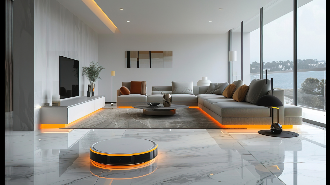
Rooms that mix wood, metal, and upholstery can feel settled, calm, and visually rich. Trouble starts when grain, sheen, and fabric weight compete for attention at once. Good pairing depends on proportion, undertone, and repetition, rather than trend. A space reads clearly when each surface has a reason to be there. With a few practical rules, mixed materials stop feeling accidental and start looking composed.
Start With One Lead Material
Most mixed rooms improve once one finished task takes the lead and everything else supports it. In practice, editors often point readers to the high-end modern furniture boca collection as a useful reference for balancing warm timber, slim metal frames, and quiet textiles. That approach keeps attention on proportion first, then lets accent materials repeat with purpose.
Match Undertones Before Colors
Surface temperature matters more than many paint chips suggest. Pale oak, linen, and brass sit comfortably together because each carries a warm base. Blackened steel, gray wool, and smoked walnut share a cooler cast. Strong contrast can still succeed, though a linking element, such as a rug or wall tone, usually helps connect both sides.
Limit the Metal Story
Metal acts like trim in a tailored jacket. Too many finishes scatter the eye and weaken the room’s structure. Two tones are usually enough for depth. Matte black and brushed brass work well because one feels graphic while the other reads softer. Chrome can be included, though it needs to play a limited role.
Let Texture Do Part of the Work
Texture often creates contrast more gracefully than color. Open-grain oak beside smooth leather adds depth without visual noise. Bouclé near powder-coated steel softens a rigid outline and makes the whole composition feel easier on the eye. Flat, uniform surfaces across every piece can seem stiff. Varied touch points bring relief while keeping the palate controlled.
Watch Proportion Across Pieces
Scale affects material balance as much as finish choice. A thick timber table can hold its own beside slim metal dining chairs because mass meets lightness. Problems appear when every item carries visual weight. Upholstered seating helps absorb that density. Glass, used sparingly, can also reduce heaviness and give darker surfaces more air.
Keep Wood Tones in the Same Family
Exact matching rarely looks natural, yet random timber shades can create friction. A safer route keeps undertones aligned while allowing depth to vary. Ash, white oak, and smoked oak usually cooperate because their temperatures stay close. Red cherry beside gray oak feels more abrupt. One darker anchor piece can work if nearby woods support it.
Test the Palette in One View
Materials should be judged together, not one sample at a time. Designers often gather swatches, finish cards, and photos in a single line of sight before buying larger pieces. If one element dominates too early, the mix usually needs adjustment. A practical ratio helps: one leading material, one support finish, and one smaller accent for contrast.
Use Contrast With Restraint
High contrast gives a room energy, though excess can create strain. Black steel against pale oak feels crisp because the difference is clean and easy to read. Add velvet or textured wool, and the pairing can still hold if walls and flooring stay quiet. Strong combinations need visual rest. Restraint keeps bold surfaces from becoming tiring.
Conclusion
Successful mixing relies on editing, not excess. A clear lead material, related undertones, limited metal finishes, and steady texture shifts help interiors feel coherent from every angle. Upholstery softens structure, wood adds warmth, and metal sharpens form when each one has room to work. Repeated shapes and measured contrast keep the composition settled. That is what allows a modern room to feel layered, polished, and comfortable.
Article received via email